Creating Even Text Background
- Best Practices
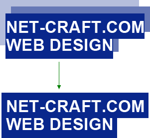
Applying contrasting background for titles is considered to be one of the latest tendencies in web design. See example below:

At first sight this task seems to be quite easy, however it may be difficult to realize it. Using «add padding» option you will begin to experience certain difficulties. The point is that padding is added to beginning and the end of text only. So, all line breaks will be ignored.
Once upon a time this task was almost solved by Yuriy Artyukh. The method was based on adding border to a child element. Nevertheless, the work hasn’t been 100% completed. There was no padding at the end of the first string (the place, where words are carried to) anyway. Other solutions I was sent via Twitter had the same problem. Line breaks had not been specified correctly.
So, how to do this?
In a simple case, where it was necessary to add small padding the solution turned out to be very easy. There is one property that coders usually prefer to get rid of. It is outline property. Its distinguishing feature is that in all major browsers (for example, I checked it in Safari 4, Firefox 3.5, Opera 10, IE8) outline has the same borders as text element. Therefore, the string of code provided bellow can resolve the problem completely:
span.uniform-bg {outline: #09278c solid 0.3em;}
Nevertheless, some problems took place here as well. At that time Firefox became the most problematic browser. At first, sometimes this browser provides outline with a small padding from text borders. Secondly, it underlines outline between strings overlapping text:

The first problem is solved quite easily. It is enough to contract outline by using outline-offset CSS-property specially for Firefox. The second one is resolved by adding additional wrapping from position:relative, in order to move test above outline.
Thus, the final solution can be described in the following way:
<style type="text/css">
 .uniform-bg {background:red; position:relative; outline: #09278c solid 0.3em;}
 @-moz-document url-prefix() {.uniform-bg {outline-offset:-0.04em;}}
 .uniform-bg span {position:relative;}
 </style>
<h2><span class=”uniform-bg”><span>Hello everyone</span></span></h2>
It doesn’t work in IE6—7, because these browsers don’t support outline property. Taking into account the fact that this task is very crucial it can be united with the method proposed by Yuriy Artyukh. Acting in such a way we will receive almost ideal solution in the end.
Our colleague, Roman, showed a bug in background drawing in the place of line breaks for IE6—7. Some work was performed to improve it and we have quite a good solution.
Honestly, I am not satisfied with such a method at all. There are some restrictions on string height (the problems between lines occur if values are high) and outline thickness (very thick outline looks bad). I suggest readers to think together with me and provide more flexible solution. Let’s try to do the same with background image. Sounds very fantastic!
The Second Method
The same colleague, Roman, has proposed another way to resolve the task. It is based on shifting layers towards each other. If, for example, padding equals to x, the second layer will be shifted right and will have a value – 2x, the third one will be shifted left and will have a value –x:

It can be simplified by taking away one layer and adding left border to container. This method is more flexible comparing with outline (that is not very friendly with Opera). On its basis I wanted to develop a solution with image background, but faced a problem. The background was shifted together with line breaks. Thus, the background of the second string begins at the place, where the background of the first string finishes.

Based on original article by Sergey Chikuyonok.